
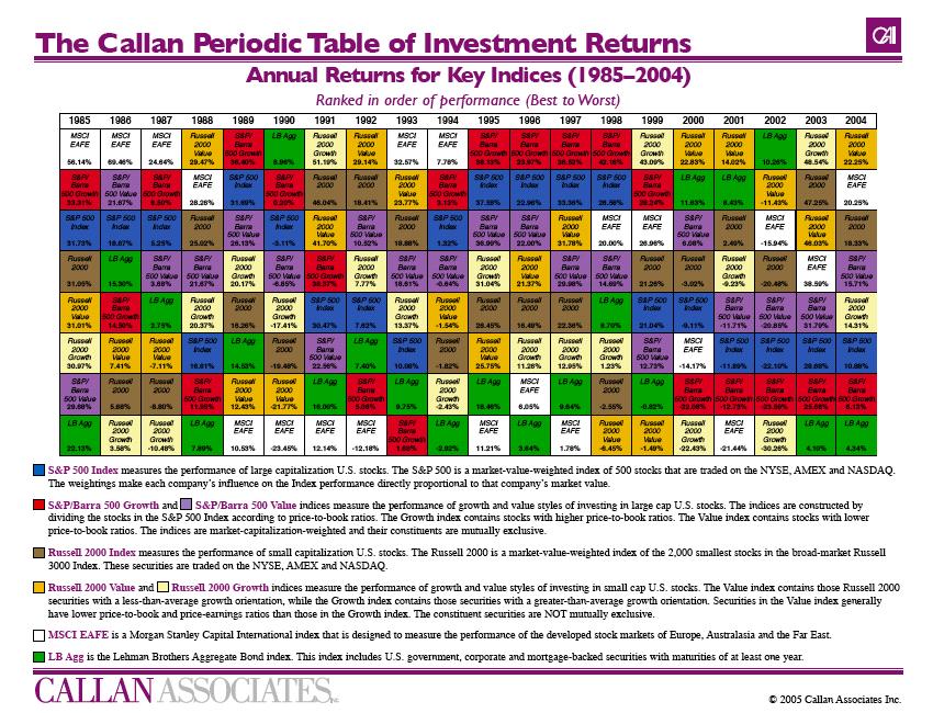
Oooh....Look at the Pretty Colors
Gotta love pretty things that help explain something important!! Below is a picture of the Callan Period Table of Investment Returns: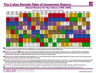
Download the Callan Period Table of Investment Returns (85-04) here
This chart clearly shows that the what asset class leads in percentage return one year, is not necessarily going to lead the market the next. It supports the academic financial publications that say 90-92% of a portfolios returns are generated by being diversified in different asset classes. So if you own a group of asset classes you are protecting yourself and mitigating downside risk of a particular asset class.
posted by Financial Fruition @ 10:56:00 AM
![]()
![]()


0 Comments:
Post a Comment
<< Home